Wednesday, March 2, 2011
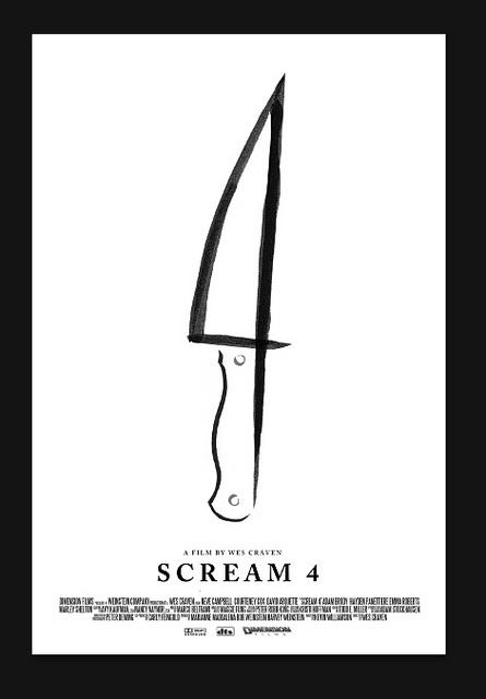
New Scream 4 concept art/teaser poster......
Saw this little doodle on the webs today and thought I'd share it with all of you ghouls who haven't seen it yet. The image is courtesy of Empire Magazine by way of Bloody-Disgusting. I don't normally just copy and paste stuff from other blogs/websites, but I just wanted to let everyone see this poster who doesn't visit that site or read that magazine. Oh and most importantly, the artwork was done by Olly Moss. As for me I think it's one of those, "It's so weird I think I like it!" types of things. The Minimalistic approach is great, but as people were stating on the Bloody-disgusting article comments, it doesn't really look like a "Ghostface" knife. Anything is better than the age old floating heads poster design though right? What do you all think?
Thank you again to Empire and Bloody Disgusting. You can read the original article by clicking here.
Subscribe to:
Post Comments
(
Atom
)


3 comments :
That's surprisingly minimalist compared to the other Scream posters! I like the 4 in the knife.
i have high hopes for this film, but it might have missed the window of success. i want so much more than just a pickle tickle... it has to be rated "r" and if not it will stink.
hope all is well!
jeremy
I agree with izombie. They might have missed the window of success. I am excited about the film simply because I am one of those people who, like the Halloween followers, keep watching the series waiting for them to click one of them into the feel of the original.
Post a Comment